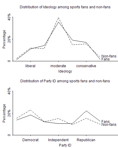
A few months ago, Yu-Sung and I summarized some survey results from the 1993-1996 General Social Survey. 56% of respondents said they attended an amateur or professional sports event" during the past twelve months, and it turned out that they were quite a bit more Republican than other Americans but not much different in their liberal-conservative ideology:

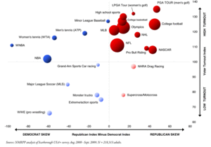
Then, the other day, someone pointed me to this analysis by Reid Wilson of a survey of TV sports watchers. (Click the image below to see it in full size.)
The graph is very well done. In particular, the red and blue coloring (indicating points to the left or right of the zero line) and the light/dark (indicating points above or below the center line on the vertical axis) are good ideas, I think, despite that they convey no additional information, in that they draw attention to key aspects of the data.
Wilson describes the data as "survey results from a total of 218K interviews between Aug. '08 and Sept. '09." So I guess the standard errors are basically zero!
P.S. Wilson does this weird thing where, except in the title of his article and the label of his graph, he never uses the terms Republican and Democrat, instead writing "GOPer" and "Dem." What's with that? Has he just been writing political news for so long that he's tired of typing out the full words? I don't actually recall ever having seen the term GOPer used before, and it was a bit jarring to me. Otherwise I thought the article was fine.
 Share / Save


