
 I write on science, medicine, nature, culture and other matters for the New York Times Magazine, The Atlantic, Slate, National Geographic, Scientific American Mind, and other publications. (Find
 via Ezra Klein comes this bottom-line chart from the Center for Economic and Policy Research:
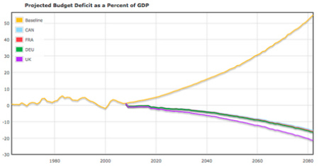
That orange line headed heaven-ward? That's our deficit. All those other lines dipping down? That's our deficit if we had the same health care spending per person as France, Germany, Canada, and the UK (all countries, incidentally, with higher life expectancies than our own). You might say, of course, that even radical reform would not bring us down to their health care spending. We could copy France's system wholesale and still pay more for care. You would be right. But such reforms would bring us much closer than we are now.
This is a nice turn, for it gets at perhaps a more important point more directly than does even Peter Orszag's scary graph about health-care spending as a percentage of GDP. And as Klein notes, this graph clearly doesn't mean we can automatically reap all savings these other countries generate by adopting their systems wholesale. But to emulate the key parts would definitely save money -- and to not do so is to further compromise our competitiveness (and lower our quality of life by spending an increasing part of income on inferior health care).
Klein presents the graph as part of rebuttal to some material lately from the (rightly admired) Tyler Cohen. It's a good rich dialogue going there. Get the whole thing at Ezra's new blog at Washington Post.